Chickens-
Welcome to another installment of the final house reveal! Today will be mostly pics, since the second floor has been fairly exhaustively covered on the blog previously, but I wanted to give a quick run-down of the main elements for you.
For starters, it is finally time to reveal the staircase! As you all know, when this was a three-flat, the stairs were not ideal. There was one long run going from the first floor to the second, and another from the first to the basement, and winders everywhere. As my klutziness is well documented, winders are a very bad idea, especially as I get older and my footing becomes, god help me, even less sure. She is no nimble-hooved mountain goat, your Polymath, and falling down the stairs is not a nice way to spend one's golden years. And stairs are important in this house. In terms of design, literally the one element that transforms it from three apartments into a single cohesive home is the staircase, so we needed to get it right. And which is more, we needed it to look original.
From a design perspective, that meant strong woodworking elements, like newel posts with a lot of trim detail, elegant handrails, and an all-wood stained staircase. This is a complicated thing. If you are carpeting your stairs, as most new construction homes do, the staircase just needs to be functional, the wood sturdy not necessarily pretty, and they can go up in a couple of weeks. Not so for a custom artisanal staircase where the wood has to be gorgeous and pristine, where the stain has to be an exact match to the woodwork in the rest of the house.
Fox Valley Stairs to the rescue. They have been doing these kinds of staircases for years, and the moment they presented their design to us, we knew they understood the project. They were able to match the design of the original newel posts we had removed, incorporated generous width to the stairs and large landings, so no more winders, as well as lovely details like gooseneck railings. It was very disconcerting to live with a 40-foot hole in the middle of my house for a few months, but the end result could not have been more spectacular. Our painter Jesse and his terrific team did a layering effect with several colors of stain to match the depth and patina of the original woodwork in the house, and our flooring guys at World Flooring gave the landings some punch with custom inlaid patterns.
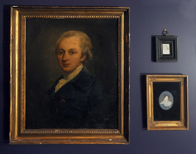
When it came to our part, we had one major design element to address. Way back, in the beginning, I had said to my Charming Suitor that the grand staircase is usually where the chateaus and manor houses hang all those gilt-framed oil portraits of the ancestors. He asked politely if I had any of those lying about, which I had to confess I did not. He was equally bereft of Old Masters capturing his people back in the day. But we both loved the idea. So we started collecting other people’s ancestors to hang in the stairwell. We were going to need a backdrop color that really highlighted them, and we knew we wanted some real depth of color in the stairs, and CS suggested eggplant purple, which is my favorite neutral. It just goes with everything. The color, Majestic Purple from Sherwin-Williams, really shows off both the stairs themselves and the artwork to great effect. On both the first floor and second floor we installed these gorgeous console tables that were a gift from dear friends. They are the perfect spot to drop the little items we are forever moving from floor to floor. We topped it off with a large brass dome pendant light.
This is my office, the main highlight of which are the walls, which my bestie Rachel and her husband upholstered in moss green velvet. It makes the room super cozy, and deadens all outside sound. I confess to doing most of my work on the antique daybed. I schlepped the stripe fabric back from Paris, and our upholstery guru Beth Laske-Miller made the cover for the mattress. The antique hospital bed table works wonderfully for my laptop. But despite working mostly on the bed, I do love my desk. The piece is from the 1830s, and has all the fun cubbies and hidey-holes that anyone could want.
The den is the room we live in the most, it serves as our daily hangout spot and where we entertain for casual evenings. I loved doing the custom sofa in the turret, it is a great spot for pre-dinner cocktails and the big gray sectional is a terrific flop around couch. And all of our little trinkets and treasures like to live in the converted architectural file table.
This is the Paris room, our guest room for single people under 5’8”. That’s the thing about an antique bed, people were much shorter then. I’m tempted to put up a sign that says you have to be LESS than this tall to ride this ride. But it is a cozy fun little room, and the people who have used it seem to have enjoyed it so far.
This is the Hampshire room, the other guest bedroom on this level, and the scale is quite a bit grander.
Here is the bathroom on this floor, CS designed it as a meditation in white, mostly reproductions of period tiles and fixtures, and a very zen place to make one's ablutions. The fixtures in here are all Kohler.
And of course, the kitchen, which we have covered to the nth degree here, so I will let the pics speak for themselves.
As a reminder, on the big ticket item front, the cabinets are Poggenpohl; the countertops are Dekton from Cosentino; the ovens, gas range and hood are all BlueStar; the induction burner, steamer and warming drawers are all Gaggenau; the rotisserie is La Cornue; the refrigeration is all Marvel; the dishwashers are Miele; and the sinks and faucets are Blanco.
Stay tuned and we will head up to the fourth and final floor…
Yours in Good Taste,
The Polymath


Incroyable! I love the juxtaposition of the modern kitchen with the antique features of the other rooms. And, besides the fact that every room is stunningly beautiful, the house doesn't look like a museum. It looks loved and lived in. Fantastic job!!
ReplyDelete